
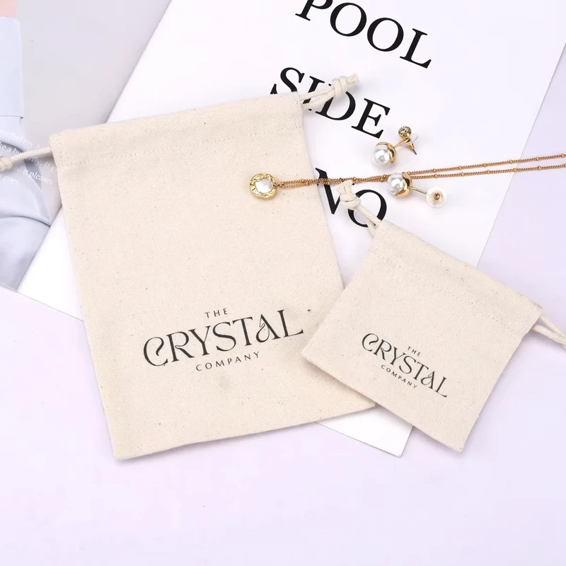
The best logo method for a custom pouch is the one that reproduces your artwork clearly on the chosen fabric, at a useful size and in a position that still looks right when the pouch is filled. Screen printing, heat transfer, embroidery, woven labels and printed labels offer different appearances. None is automatically the best choice for every material or every brand.
Choose the pouch fabric and product fit first, then compare decoration samples. A tiny jewelry pouch, a canvas cosmetic bag and a gathered handbag dust bag have very different usable branding areas. This guide gives practical starting dimensions and shows how to turn “logo in the middle” into a reviewable specification.
Compare the Five Main Logo Methods
WisePouch can evaluate these methods by project; suitability depends on the fabric, artwork, quantity and production feasibility. The options do not mean every combination is available or that every process is performed on factory-owned equipment.
| Method | Appearance to explore | Useful starting situation | What to approve |
|---|---|---|---|
| Screen printing | Artwork printed directly on the fabric | Clear wordmarks, symbols and designs with defined color areas | Color, coverage, detail and hand feel on the selected cloth |
| Heat transfer | An applied graphic whose finish depends on the transfer system | Designs needing a different color or detail approach | Compatible transfer, edge appearance, adhesion and fabric response |
| Embroidery | Raised stitched artwork | A concise emblem or wordmark with enough physical space | Sew-out, distortion, reverse side and backing treatment |
| Woven label | Artwork formed within a separately woven label | A compact brand identity or repeatable label across a range | Woven detail, finished label dimensions, folds and attachment |
| Printed label | Artwork printed on a separate label substrate | Brand text or a small information panel | Print readability, substrate, edges and sewn placement |
Labels are not all the same construction. Avery Dennison's branding overview lists woven and printed fabric labels as distinct solutions. For a buyer, this means the label material, artwork method and attachment need to appear separately in the brief.
Let the Fabric Surface Narrow the Choice
A smooth, stable panel gives a different starting surface from a coarse weave or a raised pile. Before choosing a method, record fiber composition, weave or surface, weight, color and any finish. “Canvas” or “velvet-style” alone is insufficient to predict decoration behavior.
On a visibly textured fabric, examine whether the logo needs broader shapes or fewer small details. On a glossy or pile surface, evaluate the change in appearance around the decorated area as well as the artwork itself. Hold the sample at the angles a customer will see; an acceptable head-on photograph can conceal shine changes, flattened areas or uneven edges.
Heat-applied methods need a compatible material system. STAHLS' technical discussion identifies heat marks and dye migration as concerns when decorating polyester performance fabrics. That is a reason to request a material-specific trial, not to assume that all polyester pouches reject heat transfer or that cotton accepts every transfer.
Embroidery adds thread and may require stabilizing materials. Madeira explains backing's role in supporting fabric and limiting distortion. For a pouch, inspect the inside as well as the front so backing or stitch ends do not become an overlooked part of the product experience.
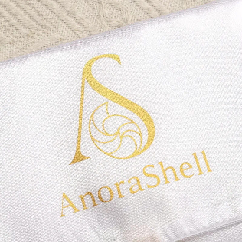
Plan Logo Size in Millimeters, Not Screen Percentages
The following dimensions are illustrative sample starting points, not minimum capabilities, maximum print areas, stock sizes or universal clearances. Pouch sizes are finished outer width × height; drawstring height includes the channel. Artwork size is the visible design's bounding width × height, not a file's transparent canvas.
| Proposed pouch | Logo or label size to trial | Initial placement reference | Main packed-view check |
|---|---|---|---|
| 9 × 12 cm jewelry pouch | 30 × 12 mm simple logo | Centered horizontally; lower artwork edge 25 mm above bottom seam | Does gathering leave the wordmark readable? |
| 18 × 24 cm gift pouch | 60 × 25 mm logo | Centered; lower edge 45 mm above bottom seam | Does the product or bow hide any part? |
| 23 × 14 cm flat cosmetic pouch | 65 × 25 mm logo | Centered; lower edge 35 mm above bottom seam | Does filling bend the mark around the base? |
| 35 × 40 cm dust bag | 100 × 40 mm logo | Centered; lower edge 90 mm above bottom seam | Does the filled bag tilt or crease the artwork? |
| 23 × 16 cm travel pouch | 40 × 15 mm finished face label | Label left edge 25 mm from side seam; lower edge 25 mm above bottom seam | Are folds and stitching clear of the design? |
These numbers establish a conversation with a sample maker. They do not replace the actual construction's printable or sewable area. For a gusseted pouch, the bottom seam may sit differently from the front-panel fold. Identify the intended reference on a drawing so “above the bottom” cannot mean two different locations.
A small pouch often benefits from a simplified symbol rather than the entire brand lockup with a slogan. Do not declare a universal minimum line thickness or text height: results depend on the specific process, fabric, color contrast and artwork. Request an actual-size trial of the smallest important details.
Work Through a Two-Method Logo Comparison
Consider a proposed 23 × 14 × 6.5 cm cotton canvas cosmetic bag. The brand wants a dark wordmark and a small illustrated symbol. Begin with a 65 × 25 mm design on the front, centered horizontally, with its lower edge 35 mm above the finished front-panel bottom seam. These are sample dimensions; the final size must also suit the packed bag.
Prepare a direct-print version and a woven-label alternative. For the label, simplify the artwork into a proposed 45 × 20 mm visible face and draw the attachment margins separately. Do not compress the full illustration until it becomes an indistinct patch. If the label is folded, state whether 45 × 20 mm means the visible face or the total cut piece.
Put both versions beside the actual cosmetics. Check readability from a normal handling distance, not just a magnified screen view. Run a finger over the front, examine the inside and photograph the bag after filling. The printed logo may better preserve the open canvas surface; the label may provide a useful defined brand area. Decide from those observed differences rather than assuming one method is inherently more premium.
Keep the chosen sample and its artwork version together. If the fabric color changes later, reassess contrast and decoration compatibility. The same digital color can look different on natural cotton, dark canvas and a synthetic surface.
Prepare an Artwork and Placement Brief
Send a vector master when available, with fonts outlined or otherwise supplied appropriately. Include a visual reference so the intended design remains clear, and state the final physical width and height. For raster artwork, provide the original high-resolution file at the intended size; enlarging a small screenshot does not restore lost detail.
Identify each required color with an agreed reference. Distinguish the fabric color from the decoration color, and make clear whether metallic appearance, a matte finish or a particular texture is essential or merely preferred. Thread, ink, transfer and woven yarn are different physical materials, so request samples where a cross-method match matters.
For placement, name the panel, define the artwork bounding box and measure from finished seams or a clearly marked fold. Record whether the distance refers to the artwork edge, label edge or artwork center. Add the expected viewing state: empty and flat, filled and standing, or gathered closed.
If a label carries care or material information, supply verified wording separately from the logo. Branding method does not establish composition, washability or certification. Do not copy performance symbols from a reference sample unless they apply to your ordered product.
Catch Mistakes Before Approving the Logo
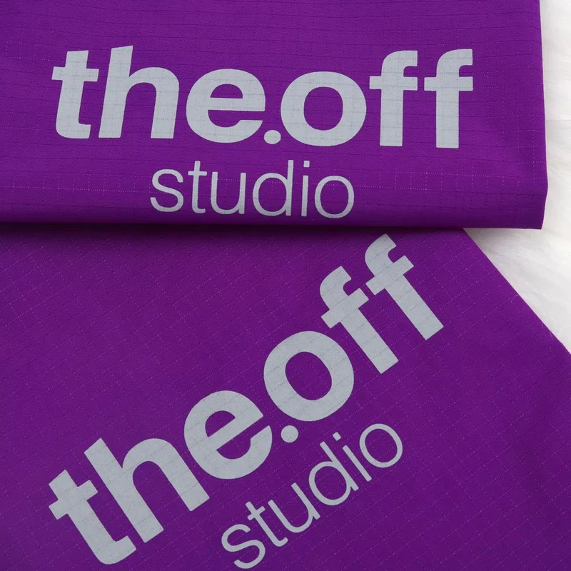
A digital mockup cannot show the feel of a large solid print, the reverse of embroidery or the thickness of a sewn label. Approve a physical sample that includes the actual fabric and construction. Check missing details, color, placement, edges and any effect on opening or gathering.
Common avoidable mistakes include artwork crossing a seam, a slogan reduced beyond useful readability, a label's folded section consuming the planned design area and a logo positioned inside the drawstring folds. Another is describing a location as “centered” without deciding whether the center refers to the whole pouch or its visible front panel.
Compare any relevant use or care conditions using an agreed sample test. Avoid promising indefinite wash life or scratch resistance from the decoration name. Record the accepted appearance and any practical limitations so repeat orders can be compared with a physical reference.
Conclusion
Choose the logo method after matching the pouch to its product and fabric. A dimensioned drawing, an actual-size artwork proof and a decorated sample give far more useful approval evidence than a method name or a digital mockup alone.
Key Takeaways
- Compare the five methods by fabric, artwork and the desired physical finish.
- Specify visible artwork dimensions and measure placement from identified finished seams.
- Inspect both sides of embroidery and the folds and attachment of labels.
- Approve the logo on the filled or gathered pouch, as customers will see it.
Frequently Asked Questions
Start with the simplest readable version of the brand mark and the intended fabric. A small print, suitable transfer or compact label may work, but the correct choice requires an actual-size sample. Raised or detailed embroidery needs enough space and a suitable construction.
It can, but confirm each size separately. The same mark may look balanced on a medium pouch and dominate a smaller one. Shared artwork does not require identical placement or identical dimensions across the range.
No universal ranking is reliable. Fabric, thread, backing, print or transfer system, construction and care conditions affect the result. Compare samples under the conditions relevant to the intended pouch instead of selecting by a general durability claim.
A digital file can be displayed at many sizes, and its empty canvas may be larger than the visible artwork. Stating the visible logo width and height in millimeters prevents ambiguity and makes sample comparison possible.
It may be possible, but readability and space must be checked. Keep the care wording accurate for the complete pouch. A separate printed information label can be considered when the brand label cannot carry the text clearly.
Related Resources
- Screen printing vs heat transfer for comparing printed finishes.
- Embroidery vs woven labels for sewn branding choices.
- Custom gift pouches for coordinating packaging and decoration.
Contact WisePouch with your artwork, pouch dimensions, fabric and quantity to discuss suitable logo methods and a sample layout.
Share your product dimensions, intended use, preferred fabric, closure, logo artwork and estimated quantity. We can review the details needed for a quotation and sample.
Discuss Your Pouch Project