
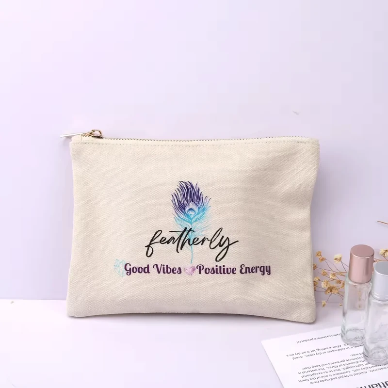
Direct screen printing is a strong starting option for clear logos with defined color areas on a suitable pouch fabric. Heat transfer is worth comparing when the artwork, colors or desired finish call for another approach. The decision depends on the actual design and textile, not simply order quantity or the number of colors shown on a screen.
For this comparison, screen printing means ink applied directly through a screen onto the pouch panel. Heat transfer means a prepared graphic applied using a compatible heat process. A transfer can itself be produced by screen printing, so the terms are not mutually exclusive across the whole decoration industry. Ask which process the quotation actually includes.
Understand What You Are Comparing
Direct screen printing places the design on the fabric surface through a prepared screen. The appearance depends on ink, fabric texture, coverage and the artwork. A one-color wordmark and a large filled rectangle can feel different even when the same general printing method is used.
Heat transfer describes the application route, not one fixed material. Depending on the chosen system, the graphic may have a different thickness, edge, sheen or flexibility. A sample from another project is useful as a reference but cannot approve an unspecified transfer on your chosen pouch fabric.
| Comparison point | Direct screen printing | Heat-applied graphic |
|---|---|---|
| Design to investigate | Defined logos, text and areas of color | Artwork requiring a suitable transfer's color or detail approach |
| Surface appearance | Influenced by ink deposit and fabric texture | Influenced by the transfer material, edge and finish |
| Setup discussion | Color separations, screens, coverage and production quantity | Transfer type, artwork preparation, application and quantity |
| Fabric check | Ink system and curing compatible with the material | Adhesive and application compatible with the material |
| Approval priority | Detail, opacity, registration and hand feel | Detail, adhesion, edge appearance and fabric response |
Do not decide that one method always feels softer, lasts longer or costs less. Compare the proposed systems with the same artwork size, fabric color and order assumptions. A quote for a small single-color logo cannot be meaningfully compared with a large multicolor graphic on a different textile.
Check Cotton, Canvas and Polyester Separately
Record fiber composition and surface before requesting samples. “Cotton canvas” is more specific than “canvas,” but the weight, weave and finish can still change the result. Coarse texture may make tiny shapes less clean, while a dense solid print may alter how a soft panel bends. These are reasons to examine a fabric-specific proof.
Polyester requires particular attention to the selected decoration system. Avient's printing guidance discusses dye migration and the need for suitable ink systems on polyester. STAHLS' heat-printing guidance also identifies dye migration and heat marks as concerns on performance fabrics. Both support testing the actual material rather than relying on its general fiber name.
A white logo on dark polyester is therefore a useful compatibility question to raise early. Ask the decorator to select and validate an appropriate system, then evaluate the sample after the agreed conditioning or observation period. Do not substitute an internet temperature or time setting for the specific ink or transfer instructions and the actual equipment setup.
If the fabric has a coating or finish, disclose it. The body textile's fiber content does not describe every surface that a decoration must bond to. Similarly, a successful print on one fabric color should not automatically approve every colorway without review.
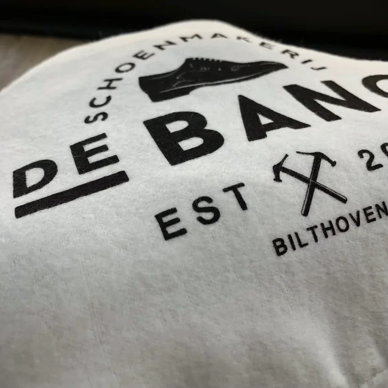
Choose Logo Dimensions Around the Pouch Panel
All numbers below are sample design starting points, not universal minimum detail, maximum print areas or guaranteed process capabilities. Pouch sizes are finished outer dimensions. Logo sizes refer to visible artwork width × height, excluding empty margins in the file.
| Proposed pouch | Artwork size to compare | Sample placement measured from finished seams | What may change the result |
|---|---|---|---|
| 12 × 17 cm cotton jewelry pouch | 35 × 15 mm wordmark | Centered; lower edge 30 mm above bottom seam | Small text, fabric texture and gathered folds |
| 18 × 24 cm gift pouch | 60 × 25 mm logo | Centered; lower edge 45 mm above bottom seam | A bow or a rigid packed product |
| 23 × 14 cm flat cosmetic pouch | 70 × 25 mm logo | Centered; lower edge 35 mm above bottom seam | Zipper bulk and the filled front-panel shape |
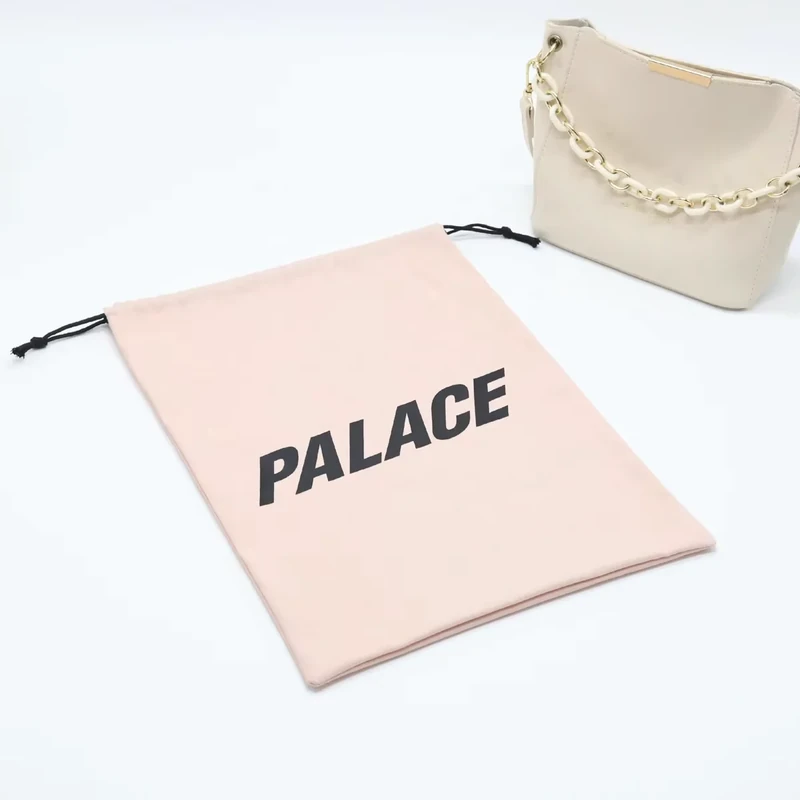
| 35 × 40 cm dust bag | 100 × 40 mm logo | Centered; lower edge 90 mm above bottom seam | Large folds and the display orientation |
Use these dimensions to make an actual-size paper layout, then request a decorated fabric sample. A logo that is sharp on a monitor may contain details that are barely visible at its intended physical size. Ask for the important thin lines and small lettering to be assessed individually; there is no single minimum that applies to every ink, transfer, fabric and design.
Keep artwork away from seams, channels and zipper structures according to the reviewed construction. A blanket clearance rule cannot account for all pouch shapes or equipment access. Mark the intended artwork location on the drawing and let the sample demonstrate whether it can be produced consistently.
Run a Fair Side-by-Side Sample Comparison
Suppose a brand develops a 23 × 14 cm flat cotton cosmetic pouch with a two-color logo. Start with a 70 × 25 mm visible design, horizontally centered and with its lower edge 35 mm above the bottom seam. Request the same artwork size and agreed color references for a direct-print sample and a suitable transfer sample.
First compare readability. Look at the edges of letters, internal gaps and where the two colors meet. Next examine the fabric around the design. Check whether the decorated area changes sheen, lies differently or shows an unwanted outline. Finally handle the pouch: bend it gently as it would bend around the intended cosmetics, and assess the feel of the decoration against the undecorated fabric.
Fill both samples with the actual product set. If the bottom becomes rounded, the logo may appear lower or partly turn underneath. Correct the placement on both versions before deciding which finish looks better. Otherwise you may be comparing a good position with a poor one rather than two decoration methods.
If a dark polyester version is also planned, treat it as another material sample. A successful cotton result does not establish compatibility with the polyester colorway. Record the chosen system and its approval sample so the later order does not become a generic instruction to “use heat transfer” or “use screen print.”
Compare Costs and Care Expectations With Equal Assumptions
Ask for quotations against the same specification: pouch fabric and color, visible artwork dimensions, number of positions, design colors, quantity and packaging. Confirm whether artwork preparation, screen or transfer setup and sample revisions are included. A lower unit number is not necessarily a lower total if the quoted decoration area or setup differs.
For a set of pouch sizes, decide whether each size uses the same artwork dimensions. Reusing one logo size can simplify the visual range, but it may look too dominant on the smallest pouch. If separate sizes are needed, provide each physical dimension so the quotation reflects the real job.
Care requirements should be agreed for the completed pouch. The decoration system, fabric, lining and trim all contribute to how it can be used and cleaned. Avoid ordering a washable design based on a general statement that one print method “never cracks” or “does not peel.” Specify the intended care and request appropriate sample evaluation instead.
A decorative gift pouch may need a different assessment from a laundry bag expected to undergo repeated care. Keeping those uses distinct helps avoid paying for an irrelevant specification while overlooking the one that matters.
Catch Artwork and Approval Mistakes Early
Do not send only a screenshot with the instruction to copy it. Provide the original artwork, a visual reference, final width and height, color information and the intended placement. Explain whether gradients, fine illustration or small text are essential; a simplified alternative may reproduce more clearly on the selected fabric.
Do not approve color only from a photograph. Screen settings and lighting can hide differences between the fabric, print and transfer. Where color matters, retain an agreed physical reference. Check the completed pouch after normal handling, because a large print area may fold differently from a small emblem.
Finally, record acceptance criteria in useful terms. Identify the smallest text that must remain legible, the intended appearance of solid areas and the agreed test conditions. A vague requirement for “high quality printing” is harder to inspect than a dated sample and a dimensioned artwork drawing.
Conclusion
Choose between direct screen printing and heat transfer through a controlled comparison on the actual pouch fabric. Matching artwork size, position and quotation assumptions lets you judge the differences that matter: readability, color, feel, compatibility and packed appearance.
Key Takeaways
- Clarify whether the quote describes direct printing or a heat-applied transfer.
- Match the decoration system to the actual fiber, surface, finish and color.
- Specify physical logo dimensions and a position measured from finished seams.
- Compare complete samples and care expectations rather than universal durability claims.
Frequently Asked Questions
Not always. Heat transfer is a broader application category, and different prepared graphic systems can be used. Ask which transfer material and production method are proposed, then approve that specific system on your fabric.
Yes, multicolor work can be evaluated, but artwork separation, registration, coverage and cost need review. The useful question is whether your design reproduces well at the planned size on the selected pouch, not whether the method can use colors in general.
Neither is automatically best. Discuss dye migration and fabric response with the decorator, then compare suitable ink or transfer systems on the actual dark polyester. A generic sample on another material is insufficient approval.
A seam creates an uneven surface and can complicate decoration. Keep the proposed artwork within a suitable panel where possible. If crossing a seam is essential to the design, request a feasibility review and a sample of that exact construction.
The practical sequence depends on the design, access, construction and chosen method. Give the supplier the required final position and finished appearance, and confirm them on the assembled sample. Do not assume a particular sequence from the decoration name.
Related Resources
- Custom pouch logo methods for all five branding options.
- Cotton vs canvas pouches for selecting a suitable body fabric.
- Custom cosmetic bags for makeup and toiletry pouch development.
Contact WisePouch with your artwork, fabric color, logo dimensions and quantity to compare suitable print and transfer options.
Share your product dimensions, intended use, preferred fabric, closure, logo artwork and estimated quantity. We can review the details needed for a quotation and sample.
Discuss Your Pouch Project